

The recent redesign of Google Maps has sparked controversy among users, with criticism extending to a former employee who was involved in the app’s design.
The app’s updated appearance, introduced last week with features like enhanced public transit directions and electric vehicle charging station locations, has faced backlash primarily due to its new color scheme.
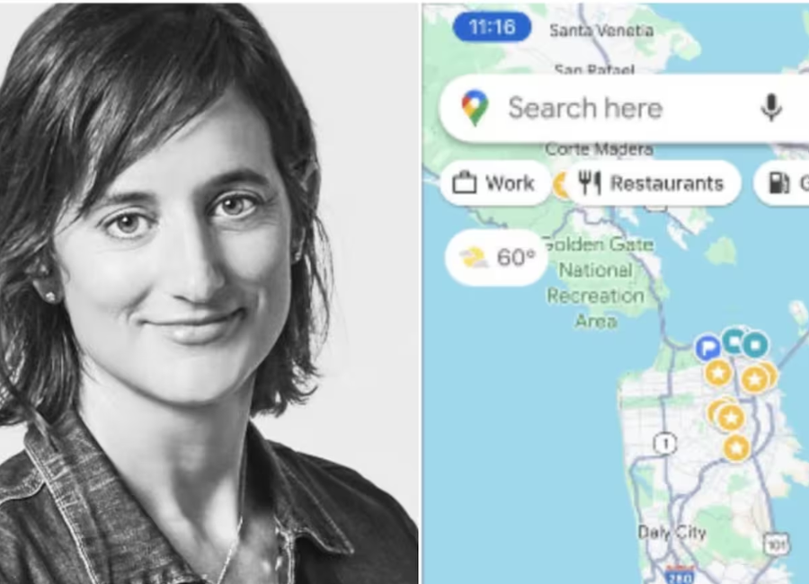
Roads are now displayed in gray, water in a lighter blue, and public spaces in a lighter shade of green.
Elizabeth Laraki, one of the original designers of Google Maps, expressed dissatisfaction with the new color palette on social media, describing it as “colder, less accurate, and less human.”
She also criticized the missed opportunity for better usability. While some users appreciated the updates for making major roads and trails more prominent, others echoed Laraki’s concerns.
The competitive landscape in mapping apps has intensified, with Apple Maps making significant strides in user experience.
Google Maps has reportedly experienced a notable decline in iPhone usage, recovering only 40% of its former mobile traffic since Apple transitioned to its mapping service. The negative public response to Google Maps’ design changes may further impact its position in the competitive mapping app market.


