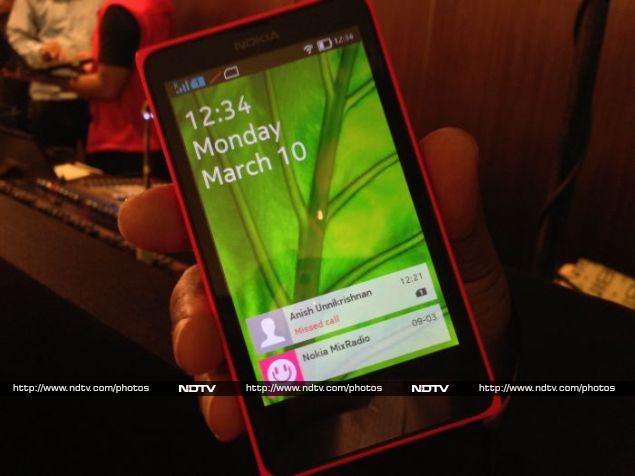
 It was anything but a well-kept secret, and when it made its global debut at the Mobile World Congress last month, we already knew nearly everything there was to know about it. Still, there were a few details we wanted to clear up about the Nokia X, and we had our chance today at the India launch event.
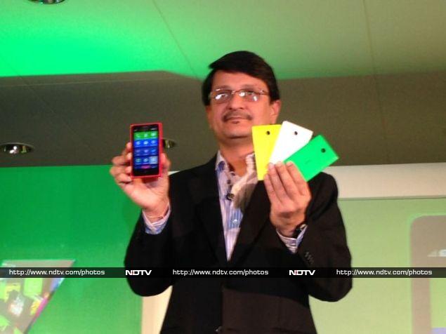
Nokia India’s Marketing Director, Viral Oza, and Head of Channel Development, Joyce Ray, introduced the new Nokia X and gave a live demonstration, following which we got our own hands on the device. The Nokia X is available from today at Rs. 8,599 plus VAT (which will vary between states), while its siblings, the X+ and XL will launch sometime in April.
The Nokia X is surprisingly lightweight, but feels solid in the hand. It’s much more like the most recent Asha models than any Lumia, although it’s being positioned as a “feeder” that will help attract users to Lumia models. The colours, shape, and even the lone back/home button on the front panel are extremely reminiscent of the Asha 501.
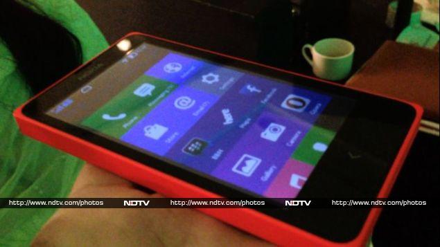 The Nokia X is a dual-SIM phone with a removable back panel and battery. There’s not much to see around the edges, apart from a volume rocker and power button on the right edge, 3.5mm headset jack on top, and Micro-USB socket on the bottom. The rear panel is blank apart from a small camera lens, with no accompanying flash.
The screen is decent enough, considering the phone’s price. It takes a few seconds to become familiar with the conventions of the new UI, but anyone who’s used a modern smartphone will quickly feel at home. Nokia’s trademark Glance screen shows you the time and notifications for missed events even when the backlight is off and the device is in standby mode. A long press on the power button brings it to life.
Upon unlocking the phone, you’ll see a main menu that can be scrolled quite a bit. The menu is customisable, but there doesn’t seem to be a way to dock frequently required icons, such as the dialler and messages app. There are multiple sections to this long menu. In addition to app icons, there’s a widget showing upcoming calendar appointments. Icons can also be clustered into groups with space between them, rather than flowing in one continuous mass.
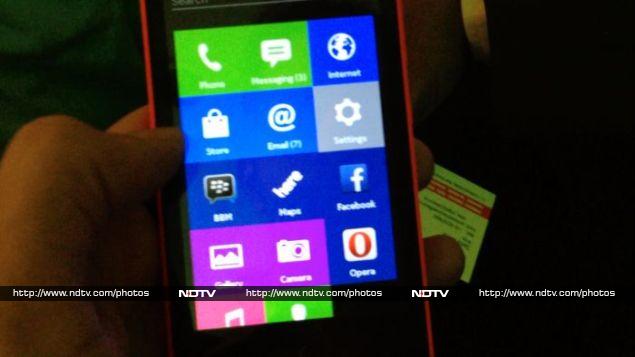 The Nokia X is built using the Android Open Source Project, and as such is not certified by Google, which means that there’s no Google Play store, and in fact no apps that are based on Google’s APIs will work. You won’t find any of the usual Android apps, including Google Maps. Nokia is happy to promote its own Here! Maps app, complete with voice directions. Rather than Google’s mail, storage and messaging features, you’ll find equivalent services from Microsoft.
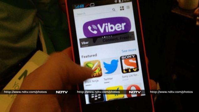
A number of “key apps” come preloaded, including Skype, Viber, Vine, Opera Mini, Facebook, BBM, Twitter, WeChat, and a number of games from EA and Gameloft. The Nokia Store app will point you to Android apps from a variety of third-party sources. You can also sideload your own Android APKs or use third part stores such as Yandex, Amazon, Opera, and Mobango.
 Nokia says over three quarters of all Android apps will work perfectly, and for those that don’t, only the parts that specifically require Google API tie-ins will be affected. The app store won’t filter out such apps by default, so it isn’t clear yet whether users will be warned about what to expect. It also isn’t clear how apps will work with the Nokia X control scheme, which uses only a single interface button rather than the usual three found on Android devices.
Scrolling and swiping through the interface is fast and natural, but apps do take their own sweet time to load. We didn’t try anything other than extremely light gaming, and that seemed good enough. The browser is fairly full featured, and the camera app is easy to use.
There’s an activity feed you can access by swiping to the right from the main menu. It’s much like the notifications shade in other operating systems, and also includes quick music playback controls. You can tap a message to reply to it, and also personalise it according to what kind of notifications you want to see.
The UI is well designed and feels coherent, with little details getting the attention they deserve. If you notice a small bar right at the bottom and in the centre of the screen, it means you can flick upwards to get to a list of options that apply to the current app or view.
The only confusing part is the back/home button which doesn’t always do what’s expected. Tapping it lightly seems to take a user through a number of screens that might have been open before, not necessarily the ones he or she just used in the order he or she used them. A long-tap takes you back to the home screen. It might have been simpler to separate these functions, like Android does, or use on-screen navigation controls, as iOS does.
 Overall, the Nokia X is an intriguing product. Nokia has had to make a lot of careful choices when it comes to the device’s features and specifications, in order to keep the price down. Most people will bemoan the relatively weak processor and camera, but these were necessary to position the X below even the Lumia 520. Since it’s widely known that this phone runs Android, Nokia will also have to overcome user confusion at the lack of an official app store.
 If the company can take care of those things, it might find a lot of people flocking to the Nokia X and its siblings, largely because of a lack of high-quality products from known, trusted brands in its price range. Finally, with Microsoft’s acquisition of Nokia practically complete, it remains to be seen whether the combined entity will support the Android-based platform even as it competes with Windows Phone.
Source: gadgets.ndtv.com


