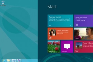
 Microsoft seems to have admitted that its bold new Modern user interface and touch-friendly strategy has not paid off. Real-world usage telemetry has convinced the software giant that desktop users are inconvenienced by the Start screen and live tiles, which took precedence over the traditional desktop in the initial release of Windows 8.
With the release of Windows 8.1 last year, Microsoft allowed users to choose whether they see the desktop instead of the Start screen when they first boot up their computers. According to leaks published by Russian website Wzor, the option will be enabled by default in an upcoming Windows 8.1 update. However, hitting the Start button (or clicking the recently reintroduced Start button) still brings up the full-screen tiled interface. The Windows 7-era Start menu is nowhere to be seen, which will undoubtedly still leave some users unsatisfied.
The latest Windows 8.1 build seeded to Microsoft’s partners includes a number of tweaks aimed at easing keyboard-and-mouse users into the Windows 8 environment. These include the ability to pin Modern apps to the taskbar and launch them from within the desktop, and the addition of Search and Shutdown buttons to the Start screen. These actions previously required touch-centric gestures which were cumbersome to perform with a mouse.
Another Windows 8 annoyance was the use of horizontal bars across the top and bottom of the screen instead of in-place context menus. When right-clicking a tile or other element within the Modern UI to bring up its options, a user would previously have to stretch all the way across the screen to reach the option. Now, familiar right-click context menus appear right where the cursor is.
Modern apps will also now have their own close and search buttons. A bar much like traditional Windows title bars will appear across the top of Modern apps (most likely only when the mouse cursor hits the top of the screen) and will present the user with Close, Minimise, and Snap controls. Snapping previously required the user to “grab” an invisible area at the top of the screen and drag the apps to either side of the screen to snap them into place.
Despite initial scepticism and a year of lukewarm reception to its beta releases, Microsoft went full steam ahead with the initial launch of Windows 8, including its radically redesigned user interface. Beset by declining PC sales and the rise of a tablet market it had no control over, Microsoft tried to create an OS that would bridge the best of both worlds and enable convertible laptop-tablet hybrid PCs. Windows 8 was also supposed to kick off Microsoft’s Windows App Store, giving it the same kind of control over software delivery as its competitors enjoy with their mobile OSes.
However, Windows 8 adoption has remained low, and consumers have vocally demanded the restoration of the Start menu. Businesses have shied away from upgrades due to the cost and complexity of retraining staff. Hardware vendors have been only too happy to keep shipping Windows 7 PCs to meet customer demand. Microsoft’s gradual steps to reverse course are seen as an acknowledgement that its strategy has not resonated with users.
Source-NDTV


