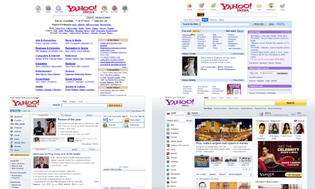
Yahoo has revamped its India homepage, introducing a new, more modern design that scales across PC, tablet and smartphone screens. The new homepage has launched today in India and five other territories. The design and features bring the Indian homepage in line with the US homepage which was revamped over a year ago. Yahoo has imagined its new homepage as something that can become a part of a user’s daily habits.
The new in.yahoo.com page features a prominent carousel of top stories, with an endless news feed below it. The user can keep scrolling, and more stories will be loaded. The news feed can be customised according to the user’s interests. When signed in, the site will learn which stories the user dismisses from his or her feed, following which fewer stories related to it will be displayed. After some time, users will be asked whether or not they are interested in other topic areas.
Articles are sourced from various other websites, and could be in the form of text or video. Users can also choose to save any story for later reading. The articles can be retrieved through a section of the user’s profile no matter which device he or she signs in from in the future.
To the right of the news feed, the new design incorporates a column of widgets for weather, stocks, Flickr images and horoscopes. Another module displays upcoming birthdays of a user’s Facebook friends, if he or she chooses to connect a Facebook account. The widgets can be customised or turned off, and Yahoo indicates that more choices will be available in the future, potentially including deeper integration with external sites and services.
IM Swaminathan, Director, Media Product and Business Operations, India & South East Asia, Yahoo, described the newly launched homepage as the first phase of the product, and said that Yahoo will keep iterating based on feedback from users and will keep adding features and innovating. “Video has been one of the fastest growing categories across the globe”, he told NDTV Gadgets, later adding, “This is the starting point of our fabulous experiences”.

Prior to this redesign, Yahoo’s India homepage has had four major incarnations, with the first in 2001 followed by refreshes in 2005, 2008 and 2013. Yahoo has conducted limited bucket tests in India for the past two weeks, so some users might already have seen a beta version of the new design.
The new look will eventually spread to Yahoo’s vertical properties, such as Cricket, Finance, Movies, and Lifestyle, in addition to Yahoo’s five local-language Indian pages. The in.yahoo.com homepage itself is not available in any language other than English at present.
The new homepage design includes only one advertisement position. Video ads will never autoplay, in accordance with internal user experience policies dictated by CEO Marissa Mayer herself.
Fifty percent of Yahoo India’s traffic now comes from mobile device browsers. While the new revamp does scale to both smartphone and tablet screens, Yahoo has no immediate plans to draw users towards a Yahoo homepage app on any platform. A mobile app experience will be developed in a future phase of design improvements, while dedicated apps are currently available for weather, stocks, cricket and other interests.


