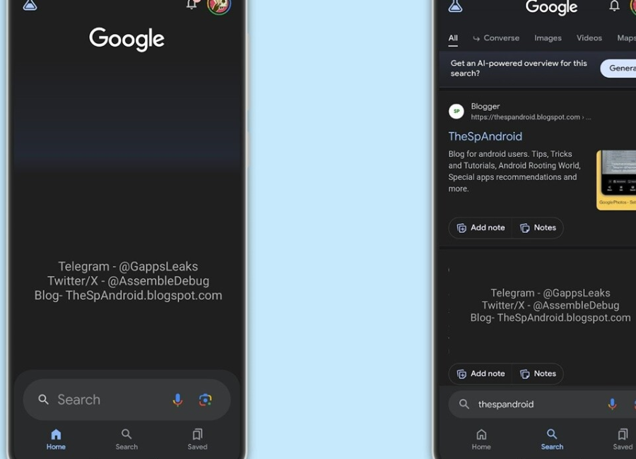
The Google app plays a vital role in the search experience on Android devices, forming part of the Google Mobile Services (GMS) suite of apps pre-installed on Android phones globally (excluding China). This app significantly influences the user experience, especially with the inclusion of a home screen widget mandated by Google under GMS. Recent reports indicate that Google is testing changes to the Google App on Android, aiming to enhance the search experience for users.
The latest version (14.48.26.29.arm64) of the Google app is undergoing tests that involve relocating the search bar from the top to the bottom of the screen. Screenshots accompanying the report illustrate the new position of the search bar. This potential adjustment holds significance for Android users, as the bottom bar is more easily accessible on all phones.

With smartphones featuring larger displays, a user interface element positioned on the top half of the screen may not yield optimal conversion rates. Users may see it but not interact with it as much. Shifting the search bar to the bottom aims to make it more accessible, encouraging users to click on it and, consequently, improving the overall search experience.
In comparison, Google already employs a bottom URL bar for Chrome on iPhones, while Chrome on Android retains the URL bar at the top. The reported change, initially observed in the Google app, is anticipated to extend to Chrome on Android, aligning with Google’s ongoing efforts to refine and enhance user interactions.


