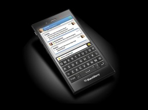
 For a generation that dopes on texting/WhatsApp-ing, the Z3 is quite a sheer delight to play around with. For the venture, it might just help you close that deal you’ve so badly wanted. For others, it’s simply not enough…
Remember the good old days when life was simpler and we all had a BlackBerry? Remember the time when its ‘oh so charming!’ track ball and the physical QWERTY keyboard were the kind of things dreams were made of? Seems like only yesterday when the Webster’s New World College Dictionary named “crackberry” the “New Word of the Year” (for 2006), greatly inspired by the use of the term to refer to the Canadian handheld device manufacturing major back in the United States. Well, that was then! Fast forward to 2014 and frankly speaking, not many people around care anymore! Once a household name for handheld devices, the ailing company now even fails to flutter most eyebrows (barring some fans) as and when it launches a new device (which honestly speaking is a rare sight these days. Most of the time the company is busy slashing prices of its already existing devices due to poor sales!). Therefore when BlackBerry launched its Z3 smartphone (wonder what Sony thinks about the ‘strategic’ naming of the device!), very few people noticed that the device is the company’s cheapest multi-touch smartphone to date. But that’s not the point here; the point is: even after finally giving in to the consumer demand (for at least coming out with a good mid-range device), the Z3 still fails to do much for the ailing company. The result is you end up with a feeling that you’ve been duped into spending more for a device that could have easily been priced tad lower than Rs 15,990…
Design & Build
If you’ve ever used a BlackBerry, you’d know its devices reek in cleverness. Primarily designed for the enterprise users, BlackBerry devices offer just the right amount of ‘showing off’ quotient without messing around things overdoing it. The trend continues with the Z3 as well. It’s a ‘smart’ looking device that has a distinct bar-shaped form factor with sharp edges along the four corners and slightly curved sides. It’s not a stunner; however, it’s not boring either: all in all a fairly decent looking device, although at just over 15K you’d expect some metal here and there. Not with the Z3 though: while the front of the device consists of a cover glass touch panel display, the back panel consists of non-removable rubberised plastic. The device is quite a pleasure to hold and operate with one hand, and is much easier to grasp and hold on to without the fear of slipping thanks to the ‘just enough’ curved sides and the rubberised back.
At 140 x 72.8 x 9.3 mm and 164 g the device is slightly on the bulky side, however, it’s still easy to grasp and hold. Even though it boasts of a 12.7-cm (5-inch) display size, the Z3 doesn’t look and feel overbearing since BlackBerry has utilised the screen well, result being the device looks just perfect with respect to size as well as build.
The front of the device consists of a 1.1MP camera (no flash) and the LED notification light at the top and the BlackBerry logo at the lower end.
The power button, the volume rocker and a dedicated camera button all lie on the left edge of the device, which frankly speaking is not one of the best placement tactics, especially for right-handed people. While people with big hands (considering it is a 5-inch device) might be able to reach these buttons on the left on most occasions, others would simply need to use the other hand. I for one believe, the power button should lie on the right, come what may! On the right edge lie the micro-SIM as well as the micro-SD card slots placed under a flap. Frankly speaking I had to look carefully to notice the flap which is tightly concealed and doesn’t stand out so that the device in totality looks uni-body. The headphone jack lies on the upper left corner of the device (which is fine).
One saving grace here is that the display is not ‘very’ prone to smudge/dust attack of the environment, therefore, while the device has just an average outdoor visibility, things could have been worse had it been a fingerprint/dust magnet.


